Wednesday, April 27, 2016

Bay Area Exhibition at Yerba Buena Center for the Arts

A Trap in Soft Division

In March, several of my fellow grads and student-friends took a day trip down to the Bay Area to see some art. One stop we made, not our first stop, was at the Yerba Buena Center for the Arts on Mission in the Soma area of San Francisco. One of my favorite things in this museum, perhaps my only favorite, was Samara Golden's site-specific and multi-media installation A Trap in Soft Division. It is tucked into a side room when you first enter the museum, off to the left side in room that acts a bit like a cul-de-sac off the main area of the building.

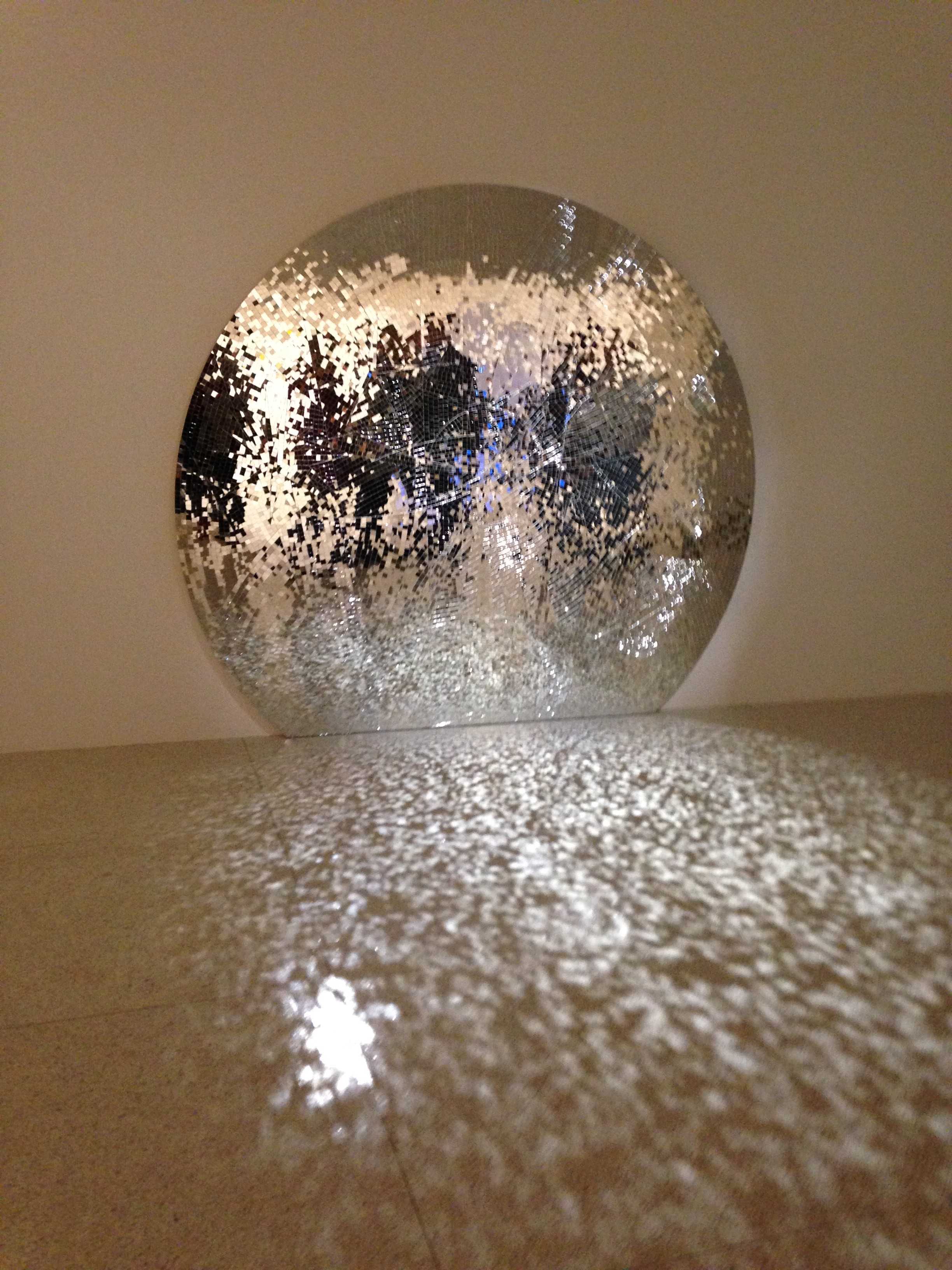
Caiti Chan and I looking down into the mirrored floor of A trap in Soft Division, 2016
When you first enter the space you are faced with a disorienting scene. Squared off in the center of the room is a white wall/fence surrounding what at first feels reminiscent of an indoor ice skating rink. The whiteness of the room hits you next, so that while you are trying to place the idea that you are potentially standing before an indoor rink wishing you had your skates, you are dazzled by the stark yet beautifully clean, pale, yet bright scene before you. By now you have reached the waist-high white wall and are trying to comprehend the "ice" of this rink, but the perspective is confusing. Then you look up towards the ceiling and the confusing view begins to register within your understanding of physical space.

Looking down to see up, A Trap in Soft Division, 2016

The "rink" that one is presented with upon arrival is not actually the core of the work. The floor within the square white box is covered with mirrors, reflecting the ceiling far above the viewer. In the alcoves of the room's ceiling are small everyday environments which are shown in the glazed floor of the space, creating an engaging and nauseating sensation of vertigo. Even when you know that what you are seeing is an illusion, the space-shifting sense that you are looking down into a series of rooms stories below you is hard to shake. The initially innocent view of the room as it is primarily presented to you falls away and you are left with this shocking sensation of expanding space. You are fighting your own awareness, and it is this experience that causes you to see your present surroundings differently. 
Panorama of A Trap in Soft Division, 2016

Samara Golden claims a desire to create a "sixth dimension" - a place in which the future, the past, and the present exist simultaneously, with the goal of creating a hypnotic, hallucinatory space that draws the viewer in completely.  Quoted from the following Youtube clip of the installation, Golden creates her work to "gesture towards the materializing the impossible."


Out of Sight, Out of Mind

The second work from the YBCA that day that I found powerful and impactful was Out of Sight, Out of Mind. Designed and completed by Pitch Interactive, a data visualization studio based in Oakland, this short narrative data visualization documents every drone strike carried out in Pakistan beginning in 2004. The visualization can be viewed here: http://drones.pitchinteractive.com/

Film still from Out of Sight, Out of Mind, 2013
Above is a still from the visualization which shows the moment right before the data punched me in the gut with the force of its presentation. In YBCA this was shown in a small black room with only two minimal rectangular stools. The screen is large enough to spread from edge to edge of your visual field. It is presented in a manner where all other stimuli seems to melt away and you are left face to face with this stylized and effectively delivered flow of data points. The data is simple; since the start of the conflict in the middle east there have been an assortment of drone strikes in Pakistan, this data visualization merely presents them in conjunction with a specific time line. However, the manner it which it is presented is impactful and clear. The data points, shown as the missiles fired from the very drones they represent, hit home with surprising resonance. The firm states that this visualization sprung out of the "inadequacies of other attempts to report the effects of an invisible technological war." 

Film still from Out of Sight, Out of Mind, 2013, showing more detail in the data points.

Monday, March 14, 2016

"Not a lecture" with Peter Schjeldahl

Peter Schjeldahl

On Thursday, March 10th, some friends of mine and I made the soggy trek to UC Davis to listen to the art critic from the New Yorker give a lecture. We arrived just in time to hear Peter Schjeldahl inform the audience that he doesn't give lectures, as he never learned how. Additionally, he does not consider himself a scholar, but a writer instead.

Schjeldahl began his non-lecture reading from The Critic as Artist by Oscar Wilde. "I pledge allegiance to Wilde's model of art criticism," he told the audience. From this reading and from his short commentary afterwards I gleaned a few enlightening quotes.

He quoted Gertrude Stein in saying "Artists don't need criticism, they need appreciation." He stated his perspective that criticism is a performing art, and that every good artist or critic is an outsider in a way that counts. One of my favorite says from him that I grabbed from his talk was "wrongness worries us more than tedium." Which I think is a powerful statement that extends beyond the realm of art into almost any area of human existence you'd like to apply it to. So often I am more afraid of having the wrong answer or doing the wrong action than I am of sitting silently and just dwelling in monotony. As artists, though, we don't have that right. We should be pushing boundaries and asking questions. Routine is a detriment to creation.

Following the reading and brief commentary, Schjeldahl took questions from the audience. When asked about his work as a critic and the writing done for it, he informed us that he didn't know if he would write anything if not paid for it. This raised some questions for me on the purpose of making work and what derives from the act of making. Is it enough to just make and never profit from the work? Or is spinning profit as existing solely monetarily disingenuous to the product created?

He answered a question of camera phones, saying that he doesn't like photography as documentation of art, "you think 'ah, I got that!' No you don't." This raised questions for me about appropriation and the idea of authenticity.

When asked about buying artwork: "Writing a check is so much more sincere than writing a review, because it hurts."

About the perception of difficulty: "It's got to look easy, that's why it's hard."

And, lastly, on the concept of memory: "Memories are always being overwritten. It's why I don't believe in memories. I think they're all bullshit. Memory is synthetic, not a recording device."

Truthfully, I did not know what to anticipate when driving down 80 to this lecture with a noteworthy and well recognized art critic, so I had no expectations to disappoint.  I came away from the evening with a lot to think about and felt far better for it. So, while this was not a lecture as they typically tend to be, Schjeldahl introduced new ideas or reinforced old ones that I had been considering.  I'm glad I was exposed to his work and way of seeing. I'd rather be wrong than complacent.

Friday, March 11, 2016

What if?


I decided I would steal/borrow/appropriate my friend Caiti's idea to make a blog post about an activity we did in our most recent Graduate Seminar this last Thursday. Caiti wrote about hers on her blog, you can find the entry at caitichan.blogspot.com

So, this past Thursday we were scheduled to have yet another grad seminar critique. These are no problem and are actually a lot of fun and insightful; you can get a lot of nice feedback that you might miss out on when showing your work to larger bodies of students, the dialogues that occur can be really good. The only thing was, this was set to be the fourth critique in a grad seminar class we had had in the last four weeks and we were all a little burnt out from the tedium. This day we were asked to select one work to show. We hung our work and were assigned perhaps at random (or perhaps not) to a fellow grad's work and asked to write 15 "what if's". No more information or guidance was given, and we were customarily released to our own confusion. 

Som was assigned a work of mine to reflect on and wrote 15 interesting "what if's" that I wanted to share. I have retyped it below to aid in readability. I should be uploading a photo of the work reflected on shortly once I am back in my studio. I also wish I had kept an image of the list I created for her. Perhaps I can revisit this post once I have had a chance to catch up with her and get some additional documentation. 


Travis (Trevor) 

What if...

  1. the object artwork it were suspended (fishing line) something that wouldn't show
  2. made the process markings were more apparent
  3. used there was a dif. shade of turquoise 
  4. there were more curves as opposed to angles, perpendicular, & parallel lines 
  5. this particular piece this piece had a backside and was displayed on a the pedestal a pedestal/ground/specific pedestal specific pedestal?
  6. more experimentation with finishing treatments to wood (stain/epoxy resin/pour wax on it/burn it/anything other than sanding it)
  7. hung on the wall crooked
  8. this piece was separated into 3 dif pieces perhaps act as a triptych
  9. backside there was a backside and displayed
  10. process parkings on the wall like in the studio
  11. shadows painted on the wall that don't necessarily match up to the piece itself
  12. hung a few more couple inches away from the wall
  13. jutting out @ an angle
  14. more holes in the side of the plywood in some kind of sequence
  15. paint the whole thing blue


Wednesday, March 9, 2016

And Bring to Bloom the Flowers - Mustafa Shaheen

Mustafa Shaheen - TRVR,  2016

So there I am. Check it out. Even got some Boston on it.


My friend Mustafa is a phenomenally talented painter, with an excellent grasp of form and light. I was honored to have the opportunity to sit for one of the nine portraits included in this recent show of his. This is a fairly delayed posting on the show, I began writing this back before Valentine's day, but I wanted to finally complete this and get it published.

This past month Mustafa had his first solo show since his graduation last December. After our art club, Form, had a group show in the Union Gallery last fall, the gallery director asked Mustafa if he would be interested in having his own show in that same gallery some months later.  He is a very dedicated painter with quite possibly the best work ethic I've seen in any of my peers. It was stunning to see how he laid out and planned his paintings for this show, the scheduling he had from start to finish and the amount of time he had to block out for each canvas to get it all done to his own particular standards.

We've had many conversations about our mutual drives, the one that fuels our perhaps irrational attention to detail and craft, the particular way in which we both try to master our respective mediums, and the intriguing way we both seem determined to explore similar but opposing needs of ourselves inside the work.

He might be the first to tell you that he is more logical than emotional, and that empathy is not an common feeling he deals with. He might be more mechanical than anyone I currently call my friend. But this interest in understanding others and understanding the emotion of empathy drives the work he does as well as informs his interactions with others. His interest is the contrast of mine, where I have an interest in exploring a more logical and mathematical self, seen in the clean lines and well planned forms of my sculpture.

It was fantastic to be able to see his work displayed as it was on such a professional level. He does excellent work, with a desire to understand the inner workings of his subjects, why they do what they do and what drives their daily decisions. There is also an fascinating element to all his work that can inform one about the tendencies of the artist; despite Mustafa's desire to understand the emotional meanderings of those around him, his work is done in such detailed and meticulous practice. His paintings, in ironic and literal fashion, might be more about him as a person than the models that sit for his work.


Friday, February 12, 2016

Making a House a Home, recent work by Helen Grandy

My friend and studio-mate Helen Grandy just recently had her first solo show up in the R. W. Witt Gallery here at Sac State. We have mostly connected in our shared sculpture classes. Helen would tell you she was predominantly a painter, though she might sound a little conflicted as she said this; Helen does have some wonderful three dimensional work, too.

Helen Grandy - Meet Me With Grace, 6' x 4', 2015
Her solo show, Making a House a Home, is comprised of several of her most recent paintings, all done in oil on varying canvas sizes. Her show is well constructed, with just the right amount of work for the space. As you walk in there are five small paintings(perhaps 5x7s?) hung in float frames to the left and a larger square composition on the right. I really enjoy square paintings. Perhaps it is the sculptor in me, but there is something spacial about them that I can connect with. Or it could be that rectangular canvases in either landscape or portrait format are far more common and more readily skimmed over or dismissed as a feature.

The Witt has an odd layout, and has almost a two room floor plan as it is currently constructed. The second room is longer and somewhat narrow, with two much larger paintings with more traditional landscape canvas sizes on the end caps. The somewhat clean/flat white walls and simple layout of the rooms play well off the hectic yet flowing and calm forms found in her paint. The minimal features in how the work is shown do not compete with the pleasantly busy way in which each painting seems to move organically within its boundaries, adding another positive element to Helen's work.

The pallet that is used is reminiscent of a 1950's or 60's kitchen appliance pastel color scheme, with beautiful blue-greens and warm reds and pinks. It is tough to say if there is any concrete imagery in the work just from a quick glance. They could be shapes and forms of flowers, or flowing colorful liquids in a greater environment. Or the efforts at laying out a more tangible world within the flat plane. The title of the show suggests self discovery. The House in the show title being the place within which one resides, and the desire to make it a Home being akin to the customization and understanding of that space that we all must do when faced with a new residence. The need to identify oneself, to know where one exists in the grand scheme of all things, and to make that location and existence their own. To know oneself. Making a House a Home.

Thursday, February 4, 2016

A return, I am The Revenant!


desiderata


[dih-sid-uh-rey-tuh, -rah-, -zid-]
plural nounsingular desideratum.

1.
things wanted or needed; the plural of desideratum : 
“Happily-ever after” and “eternal love” appear to be the desiderata of the current generation; to whom “fat chance” say those of us who are older, wiser, and more curmudgeonly.

(respectfully stolenborrowed from Dictionary.com)


So I'm back. It has been a while. 2 years? 1 and a half? Today is the fourth of February. Yesterday was the 3rd, my Grandmother's 85th birthday. That isn't immediately relevant to the subject at hand, but how often does someone get an 85th birthday? It's a once in a lifetime opportunity. Just thought I'd honor it. 

I posted the definition of desiderata, up top. I've taken to getting updates for the dictionary.com word of the day on my phone (recently it started sending me two, one at 8:07 in the morning, the next at 8:12. Everyday. Duplicates, though; they still only have a single word per day) and I have been heard at least once to joke that I'd like to use these words to name my artwork due to a lack of perceived ability at naming them myself. So I get these updates! Twice a day, but only one word. And that is today's. I felt it was pretty appropriate. 

I am nearing the Friday at end of the second week of my second semester of my first year of Graduate school. Yea. Exactly. What, you might ask? How? I am in Grad school. And so far I am going just fine(slight understatement: modesty). This guy, who completed his undergrad after 12(13?) years and a 2.7 overall GPA. Yep. 

To refocus a bit. I received the Word of the Day on my phone this morning and felt it an apt expression of my surroundings. Not too long ago I was trying to get a degree in Psychology after giving up on art. Now I am working on a Graduate degree in Studio art with a Graduate minor in Adulting. It is a legitimate degree, don't look it up, I promise it is real. Not too long ago I tried to exist without art. I found myself depressed and adrift in life. I ended up thriving at Sac State, of course I would come back and continue my prolific education here. It's what I needed to do. 

Tuesday, June 17, 2014

Institute of Contemporary Art, Boston

I've been in Boston for the last week or so, trying to soak up the sights and reacquaint myself with the area I grew up in. Circumstances have allowed me the opportunity to explore some of the City's great supply of galleries and museums, and to learn more about the art and history of one of my favorite places.

One of the first places I managed to step foot in was the Institute of Contemporary Art, located on the pier in South Boston, just below the historical North End and Beacon Hill. I had been here once before, in the frigid winter years previous, and given the beautiful weather I happily took the chance to explore the outside of the building, which is architecturally fascinating.


Before I even get to the exhibits contained within, I want to mention how much I enjoyed the structure itself, in addition to the views one gets from within. That's an odd thing to state, I imagine, given that this is a museum; one should spend their time here looking inwards at the works displayed. But the building sits right on the water, and has a 4th floor viewing deck where one can take in the sights of portions of Boston Harbor, and of East Boston across the way. Also, as you might be able to see from the picture above, there is a smaller triangular room that juts from the bottom of the upper structure. This space is where the museum has a series of computer screens with information of both the building and the featured artist exhibit on display at that time. One can sit there, change their visual input for a while, and learn about the design and creation of the ICA, as well as hear short interviews with the artist whose work you've just been enjoying. This will also offer you an amazing view, in addition to a small amount of voyeurism of the people strolling about on the pier below.


You might be able to tell, but I really enjoyed the architecture. Maybe a little more than the current showing of art, unfortunately. The current show on display is the work of Jim Hodges, titled Give More Than You Take. This exhibit explores the past 25 years of Hodges career, considering the trajectory and themes of his work. Hodges works in many mediums, with an approach similar to collage and assemblage, creating pieces from broken mirrors, denim, gold leaf, or color swatches. He works in both 2D and 3D spaces, in addition to installation art. Hodges takes everyday objects and materials into meaningful considerations of themes dealing with time, identity, loss, and love.

Jim Hodges
"Untitled (one day it all comes true)"
2013
One of my favorites shown was the massive "Untitled (one day it all comes true", seen above. Made from various shades of denim, Hodges explains that this work is the product of an epiphany he had while driving. He saw a wondrous and expansive sunset one night, and immediately imagined it as a large work made entirely from jeans. The whole piece is immense, taking up the entirety of one very large wall on the top floor of the ICA. One can spend hours standing before the fabric, exploring the nooks and crannies of the embroidery.

Jim Hodges
"Happy - A World in a World"

I also loved this work. It stands just under 6 feet, if my memory serves, and consists of just markers on paper, but despite it's overall simplicity I found it fascinating. It's all about line, for me. Still haven't figured that one out. I can stand there and follow lines and colors for hours and lose track of time completely. Which I did. There is an awesome sense of 3 dimensional space is a 2D world, the different color palettes of the inner circle contrasting just enough with the surround area to lift it above the page. On occasion there would be a break in a line of color. A little skip in trajectory. Even that is fascinating. I guess that's all you have to do to interest me: draw a line on a page.

Most of the work on display was interesting, but only just. For me, for most of it, it was more that I found the idea intriguing and potentially amazing. I found myself looking at Hodges work, and most of the time I was more interested in how I would execute it my own way. It pulled me out of the space and was a little jarring to me. In some of his works he would take a large photograph and cut smaller shapes from it, bending them outwards to create new planes in the work. This had the potential to create a very interesting contrast, to turn a flat planed work into a sculpture, but I often found myself considering the ways in which it didn't quite work for me.

Jim Hodges
Here's Where We Will Stay
1995


Hodges has a series of works made from mirrors, where they have been methodically broken and then reassembled. In some of them they've been placed in corners to allow the carefully placed light source to reflect in such a way. In others, one can stand before them and marvel at the interesting distorted image. I remain unsure as to how I feel about these. In many ways they could be successful, but somehow they don't feel that way. But, given that assessment, I feel my interest in works is further enhanced by its physical depiction. My desire to make and create work is less driven by concept, and more by the end result and the journey to that point. Hodges art is heavily based in the conceptual, something that I have a tendency to ignore, or spend little time honing and focusing. Meaning can be found in process, which I enjoy. Perhaps this is something that had me at a disadvantage when walking into this exhibit.