Thursday, February 4, 2016

A return, I am The Revenant!


desiderata


[dih-sid-uh-rey-tuh, -rah-, -zid-]
plural nounsingular desideratum.

1.
things wanted or needed; the plural of desideratum : 
“Happily-ever after” and “eternal love” appear to be the desiderata of the current generation; to whom “fat chance” say those of us who are older, wiser, and more curmudgeonly.

(respectfully stolenborrowed from Dictionary.com)


So I'm back. It has been a while. 2 years? 1 and a half? Today is the fourth of February. Yesterday was the 3rd, my Grandmother's 85th birthday. That isn't immediately relevant to the subject at hand, but how often does someone get an 85th birthday? It's a once in a lifetime opportunity. Just thought I'd honor it. 

I posted the definition of desiderata, up top. I've taken to getting updates for the dictionary.com word of the day on my phone (recently it started sending me two, one at 8:07 in the morning, the next at 8:12. Everyday. Duplicates, though; they still only have a single word per day) and I have been heard at least once to joke that I'd like to use these words to name my artwork due to a lack of perceived ability at naming them myself. So I get these updates! Twice a day, but only one word. And that is today's. I felt it was pretty appropriate. 

I am nearing the Friday at end of the second week of my second semester of my first year of Graduate school. Yea. Exactly. What, you might ask? How? I am in Grad school. And so far I am going just fine(slight understatement: modesty). This guy, who completed his undergrad after 12(13?) years and a 2.7 overall GPA. Yep. 

To refocus a bit. I received the Word of the Day on my phone this morning and felt it an apt expression of my surroundings. Not too long ago I was trying to get a degree in Psychology after giving up on art. Now I am working on a Graduate degree in Studio art with a Graduate minor in Adulting. It is a legitimate degree, don't look it up, I promise it is real. Not too long ago I tried to exist without art. I found myself depressed and adrift in life. I ended up thriving at Sac State, of course I would come back and continue my prolific education here. It's what I needed to do. 

Tuesday, June 17, 2014

Institute of Contemporary Art, Boston

I've been in Boston for the last week or so, trying to soak up the sights and reacquaint myself with the area I grew up in. Circumstances have allowed me the opportunity to explore some of the City's great supply of galleries and museums, and to learn more about the art and history of one of my favorite places.

One of the first places I managed to step foot in was the Institute of Contemporary Art, located on the pier in South Boston, just below the historical North End and Beacon Hill. I had been here once before, in the frigid winter years previous, and given the beautiful weather I happily took the chance to explore the outside of the building, which is architecturally fascinating.


Before I even get to the exhibits contained within, I want to mention how much I enjoyed the structure itself, in addition to the views one gets from within. That's an odd thing to state, I imagine, given that this is a museum; one should spend their time here looking inwards at the works displayed. But the building sits right on the water, and has a 4th floor viewing deck where one can take in the sights of portions of Boston Harbor, and of East Boston across the way. Also, as you might be able to see from the picture above, there is a smaller triangular room that juts from the bottom of the upper structure. This space is where the museum has a series of computer screens with information of both the building and the featured artist exhibit on display at that time. One can sit there, change their visual input for a while, and learn about the design and creation of the ICA, as well as hear short interviews with the artist whose work you've just been enjoying. This will also offer you an amazing view, in addition to a small amount of voyeurism of the people strolling about on the pier below.


You might be able to tell, but I really enjoyed the architecture. Maybe a little more than the current showing of art, unfortunately. The current show on display is the work of Jim Hodges, titled Give More Than You Take. This exhibit explores the past 25 years of Hodges career, considering the trajectory and themes of his work. Hodges works in many mediums, with an approach similar to collage and assemblage, creating pieces from broken mirrors, denim, gold leaf, or color swatches. He works in both 2D and 3D spaces, in addition to installation art. Hodges takes everyday objects and materials into meaningful considerations of themes dealing with time, identity, loss, and love.
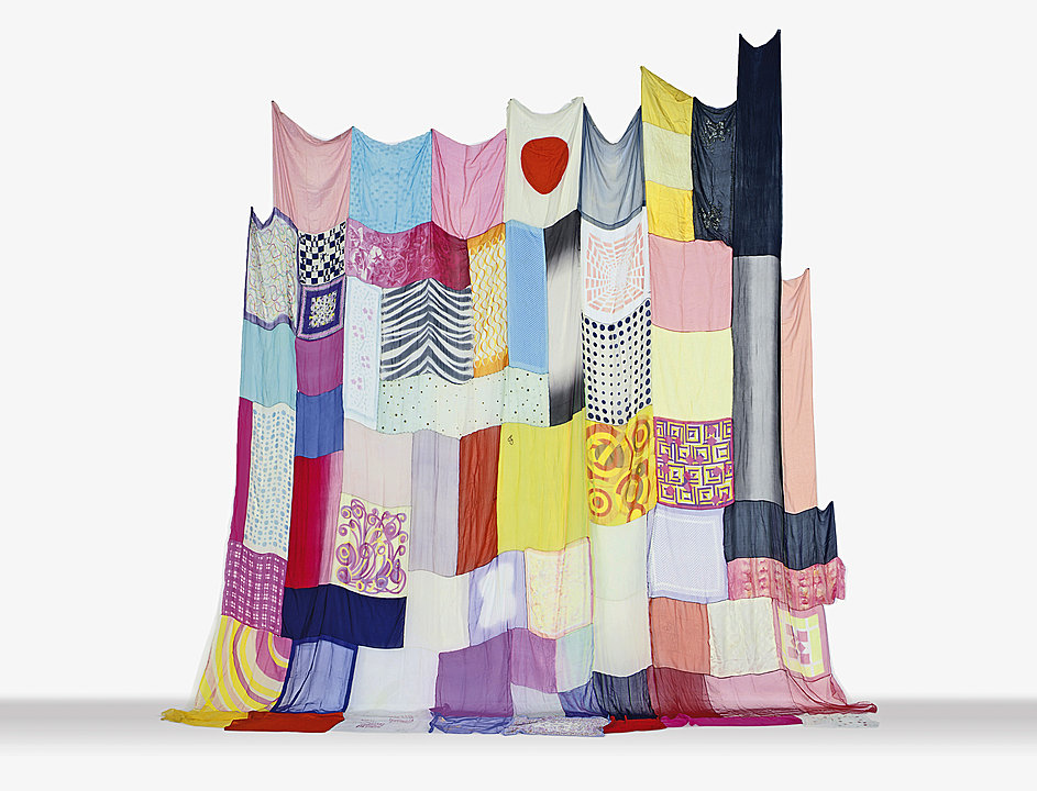
Jim Hodges
"Untitled (one day it all comes true)"
2013
One of my favorites shown was the massive "Untitled (one day it all comes true", seen above. Made from various shades of denim, Hodges explains that this work is the product of an epiphany he had while driving. He saw a wondrous and expansive sunset one night, and immediately imagined it as a large work made entirely from jeans. The whole piece is immense, taking up the entirety of one very large wall on the top floor of the ICA. One can spend hours standing before the fabric, exploring the nooks and crannies of the embroidery.

Jim Hodges
"Happy - A World in a World"

I also loved this work. It stands just under 6 feet, if my memory serves, and consists of just markers on paper, but despite it's overall simplicity I found it fascinating. It's all about line, for me. Still haven't figured that one out. I can stand there and follow lines and colors for hours and lose track of time completely. Which I did. There is an awesome sense of 3 dimensional space is a 2D world, the different color palettes of the inner circle contrasting just enough with the surround area to lift it above the page. On occasion there would be a break in a line of color. A little skip in trajectory. Even that is fascinating. I guess that's all you have to do to interest me: draw a line on a page.

Most of the work on display was interesting, but only just. For me, for most of it, it was more that I found the idea intriguing and potentially amazing. I found myself looking at Hodges work, and most of the time I was more interested in how I would execute it my own way. It pulled me out of the space and was a little jarring to me. In some of his works he would take a large photograph and cut smaller shapes from it, bending them outwards to create new planes in the work. This had the potential to create a very interesting contrast, to turn a flat planed work into a sculpture, but I often found myself considering the ways in which it didn't quite work for me.
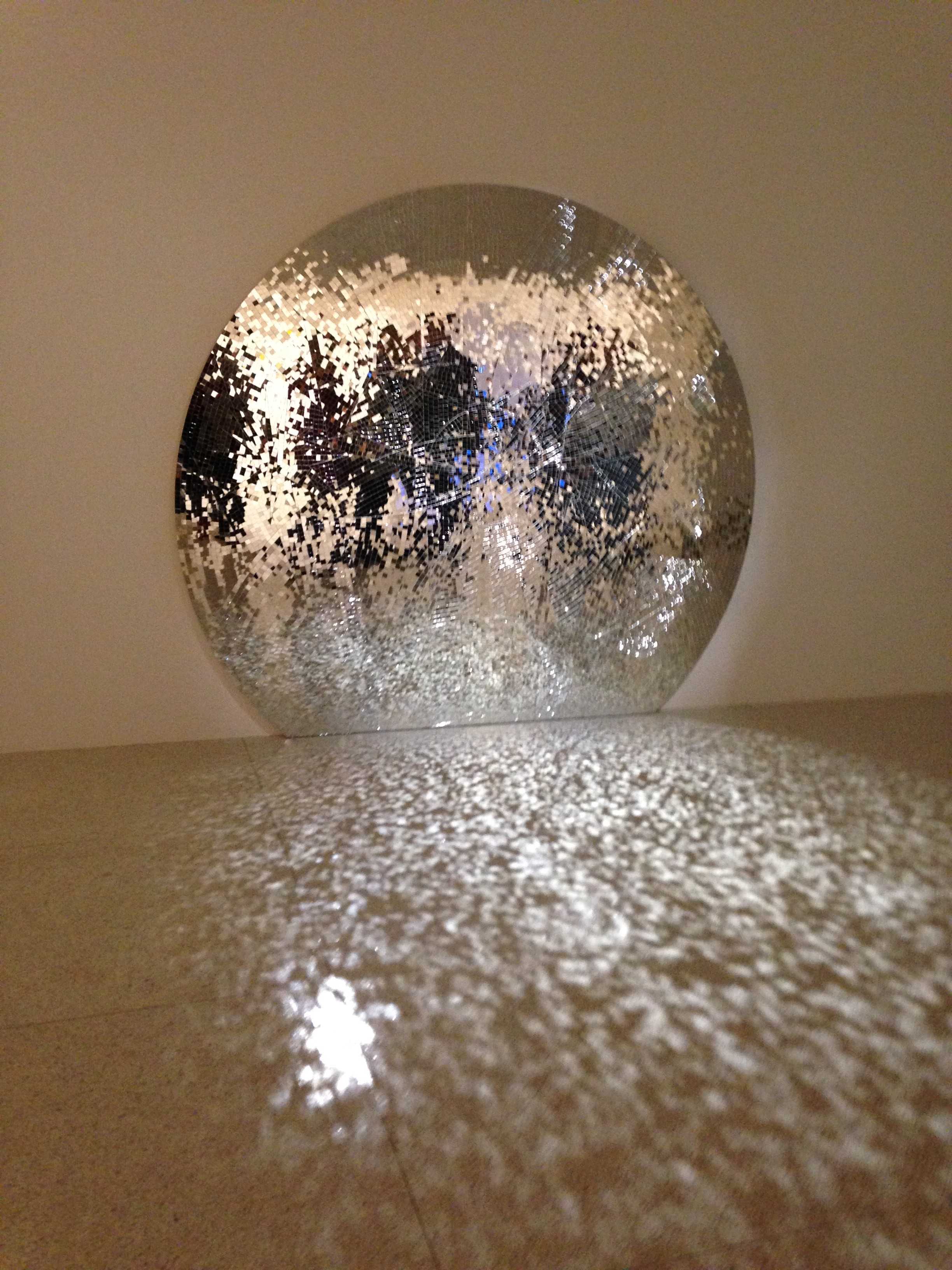
Jim Hodges
Here's Where We Will Stay
1995


Hodges has a series of works made from mirrors, where they have been methodically broken and then reassembled. In some of them they've been placed in corners to allow the carefully placed light source to reflect in such a way. In others, one can stand before them and marvel at the interesting distorted image. I remain unsure as to how I feel about these. In many ways they could be successful, but somehow they don't feel that way. But, given that assessment, I feel my interest in works is further enhanced by its physical depiction. My desire to make and create work is less driven by concept, and more by the end result and the journey to that point. Hodges art is heavily based in the conceptual, something that I have a tendency to ignore, or spend little time honing and focusing. Meaning can be found in process, which I enjoy. Perhaps this is something that had me at a disadvantage when walking into this exhibit.


Tuesday, May 13, 2014

Graduating Seniors Show

It seems that the painting I'm most drawn to, recently, is of the drippy, messy abstract expressionist variety. I stopped by the Else Gallery this week to take in the work of the graduating seniors. I've seen Sarah Dutra working behind the ASL frequently when working there and I really enjoy what she does. I find inspiration from these paintings, and am happier with my own drawing final because of it. The thin washes and drippy white acrylic overlaid on the more vibrant colors underneath give an entrancing feeling of depth, creating a three dimensionality inside a 2D space. The subtle pops of yellow and blue below reinforce the feeling of mood.

Sarah Dutra
Last Minute
Multi-Media on Canvas
2014
 I don't think it would be fair if, as a sculptor, I didn't include at least one 3D piece. I really enjoy ceramics, the practicality of it, the dual nature of having an inherent use despite a need for visual aesthetics that are pleasing. This work by Nicholas Sullivan doesn't appear to have a specific use like a teapot or a cup and saucer might, but it is beautiful all the same. I enjoy the coarseness of the building methods and the glazing as well.  Instead of using neat slabs of clay, each plane was creating by throwing the material on the table at an angle, allowing inertia to work on it, expanding the clay and picking up the imprint of the table and canvas board below. Constructed as it is, it has a vibe of a precarious structure, a previously tall tower that has buckled under it's own weight.

Nicholas Sullivan
Fountain #1
Ceramic
2013
Last is a piece by Mary May-Yuarn Fong, something truly atmospheric and haunting. Again with the drips, too. Wisps of color and line create a feeling of circular movement throughout the piece, manufacturing an environment for its contents to inhabit. The quality of paint is smoother than that of Dutra's, seen above, with a more subtle creation of space and form and a more "real" environment. I love the feeling of being in a fantastical realm, looking out on a great valley with a small city sprouting up beside a large cliff, like I'm leaving on a grand journey, not sure when I will return.

Mary May-Yuarn Fong
The Parting
Acrylic on Canvas
2014

The Land and The People

Jung Won Chul
Portrait in Gray #2, 2001
Linocut
The Land and The People is an excellent and unique look in to the work of contemporary Korean printmakers. As mentioned in a previous blog, the artists and their works are unique in their approach to their work. Over 100 years of political and historical upheaval have instilled in the Korean people a cultural sadness.  The perspectives and state of mind of Koreans, in contrast to Americans, are different because of this cultural sadness and constant state of political upheaval, and this has a tendency to lead to a different aesthetic and sensibility. The artists in this show fare from three generations and utilize a variety of different printmaking techniques, from linocut to traditional woodblock, and draw from a rich history and culture of Korean printmaking.

Jung Won Chul creates intricate and moving linocuts of surviving "comfort women", women who have been forced to service soldiers during the Japanese invasion of Asia. Every line in each candid print is another wrinkle on their face, another gruesome experience, one more hard-learned life lesson.

Detail of Portrait in Gray #2
Kim Eok approaches the landscape from a historical point of view, traveling around the country capturing features of national significance. His works are deceptively contemporary, instead of being the purely historically accurate scrolls they first appear to be. Close inspection reveals cars, birds, and other signs of life living their lives in his intricate woodcuts. The high vantage point and perspective also suggests a more modern and specific understanding of the countryside around us.

Kim Eok
Namhan River - Danyang, 2009
Woodcut

Detail of Namhan River - Danyang

This was an amazing exhibit to experience, especially once one further understands the context of many of these works. The hardships experienced and portrayed by those whose we work we are privileged to see are not lost on us. Additionally, many of the artists shown here this semester have never before been seen on the west coast, so it is indeed an honor to view their work. The difficult and unforgiving nature of the woodblock print is an excellent comparison to the hardships of being of Korean birth for the past century.

Kim Joon Kwon
From Mountain 0805, 2008


Monday, May 12, 2014

Crocker Art Museum

After attending U-NITE and only having the chance to see the student work in the courtyard, and the faculty show nearby, I had to make time to come back and see some of the current collection.

One of the first works I encountered was this massive painting by Stephen J Kaltenbach. Sitting at an estimated 8 feet tall and 15 feet wide, this work was very intimidating. I stared at it from half a room away trying to take the whole thing in, but it truly was immense. The plaque beside the piece gave a short history of this work, stating that it was a seven year long labor of "life, love, and loss". It is based on a photograph, though it is still very different and unique from the cool and detached paintings of the photorealists. This work is done as a memorial, celebrating the life and passage of a loved one. Kaltenbach typically worked as a conceptual artist in the 1970s; this enormous work marked his return to painting.

Stephen J Kaltenbach
Portrait of My Father
1972-79
Acrylic on canvas

Detail of Portrait of My Father

Paul Jenkins
Phenomena Intervening Mantle
2006
Acrylic on Canvas 
Paul Jenkins' approach to applying pigment tends to me unorthodox, reads the plaque beside this work. He pours and pushes the pain, resulting on veins of translucent and opaque colors. They are exercises in continued interesting in philosophy, the writings of Carl Jung, and exploring the inner recesses of the artist's unconscious mind.  

Detail of Phenomena Intervening Mantle

Kim Squaglia
Aquanaut
2012
Oil and resin on wood panel

Detail of Aquanaut


Hung Liu
Shoemakers
1999
Oil on canvas
After learning about the artist in class, and seeing her work, it was really exciting to accidentally stumble across this work in my explorations. The drips and the thin washes in the layers of her work are wonderful, and give a subtle sense of nostalgia. 


Checking out the abstract expressionism paintings
 The abstract expressionist Sam Francis has a large show at the Crocker, full of works from his five decades worth of painting. Francis was one of the twentieth century's most influential abstract expressionist painters, and created art that was most intuitive and cerebral. Using a variety of light and color, his works have a wide range of interpretations while also referencing traditional and historical paintings. Inspired by the French Impressionists, the California Modernists, as well as ancient and contemporary Chinese and Japanese scroll and sumi-e ink paintings, he became known as one of the first post-WWII painters to develop an international reputation.  Francis' use of color and light is truly astonishing. From a simple paint blot on a white field, to the layering of beautifully contrasting colors, I was completely in awe of his work. The detail shot below is one I spent several minutes taking in.


Untitled (Edge Painting)
1966
Oil on canvas


Saturday, May 10, 2014

How to not starve as an artist

On April 24th, Sandy Delehanty, an artist workshop instructor and watercolor painter, gave a talk on her experiences as a full time artist and what she had learned on how to succeed as a painter full time. As an artist interested in the ways of the art world, I attended hoping to learn ways in which I might best apply my skills and abilities in the hopes of making a living in a creative field. Delehanty has a multi step process she uses to illustrate one's best chance for success as an artist.

Sandy Delehanty
"Abandoned"
Watercolor

Step 1: Determine if your art is ready to earn a living for you. Have you won any local awards, have you been accepted in to any major national or international open shows? The last two types of shows are often so competitive that just getting in can be a big deal. Other things that can be a leg up on the competition are being invited on behalf of respected galleries or art organizations. Additionally, making friends with gallery professionals and getting their feedback is a great resource. Contact well respected artists in the field for their opinion on your work. Often you will want to avoid asking your family or friends what they think; they know and care about you, of course they will think your work is great. If you are not ready for this step, then it may be best to take more classes or workshops to master the elements that are weaker.

Step 2: Know how much money you need to live comfortably. It is important to be realistic with this step. Look for any ways you may be able to cut back if need be, and make sure to allow for any emergencies.

Step 3: Know where your income will be coming from. Make sure to list any and all possible income sources and prioritize them. Delehanty mentions that her original list was not the same as the list she found most accurate in practice. She found the most lucrative income to come from commercial galleries. Workshops that you organize, and workshops you do for others are next on the list in that order, followed by self-organized weekly classes and adult education classes. She actually told us to avoid arts festivals, as they did not seem to be worth the time invested for the return, especially if they weren't local.

Step 4: Research various income possibilities. Make sure you understand your time commitments. How much time per week do you need in the studio? Understand shipping time requirements, etc. Know that time is money. It is also important to have various income sources, putting all your eggs in one basket is a recipe for disaster should anything go awry.

When it comes to choosing commercial galleries to show at, there are a few specifics to me mindful of. Be aware that you are picking a business partner. The gallery with represent you to the world, make sure that any galleries you choose to show at share common values with you. Also know that location is important. Art and tourist towns generally sell more work that other locations. Additionally, make sure your work fits with the targeted market. It is important to be professional: always deliver more than promised, always be on time, and never undercut your galleries.

Being a workshop instructor can pay well, but can be a lot more work. Instructors who are nationally known can earn a very good living, but will travel a lot. To break in to the field, a solid resume is required, and teaching skills matter.

Step 5: Understand your expenses and how to control them. Make sure to list anticipated expense categories, prioritize largest to smallest. Know what you can do yourself, and learn new skills to cut costs. Take classes, read books, and watch videos.

Step 6: Set up your business. Get a business name and set up a business checking account. If you are selling directly to the public you'll need a resale license, which allows you to avoid paying taxes on any materials that will go in to your final product, such as paints and canvases. Do you have a website? Have you made business cards? Did you get a business license?

Delehanty spoke a lot about her own workshops, and how successful they had been for her. She told us about the workshops she had been recruited to do on cruise ships, and how they were a great excuse to see the world and become inspired. I asked her how she managed to get a gig teaching a workshop on a cruise liner, as that seemed like employment with a lot of suitors. "I saved and saved and then went on one myself," she said. " I watched the instructor on it and saw how it was done. I went on one with an instructor I liked and wanted to learn from; connections are important. I got to do one myself two years later. Cruise lines won't hire you unless you have a good following, either."

Sac State Art History Symposium

There were a number of interesting lectures happening at the Symposium, this year. The first of the two that I enjoyed the most was regarding Master W with the Key, as he has come to be known, and was given by John Byck, who is a Ph.D. candidate at The Institute of the Arts at NYU. Master W with the Key was known for a series of 9 prints of ships in the 15th century. These came early in the history of printmaking, and were notable for their unusual secular content, for the time. These works were also the predecessor to the Dutch Maritime Print genre. He gets his name from the way in which he would sign his works, which can be seen in the top right of the print, below. 


Master W's work with ship prints was primarily used as models for craftsmen, to be integrated into  other works for secular or religious purposes, for use in prints or woodcuts, or for goldsmiths. These depictions were a common theme for household and table items of the time. Master W's work depicts several different types of ships, and is partially responsible for our current understanding of 15th century ship rigging techniques. He is also the precursor for ship-portrait engravings, and inter-cultural genre.

In addition of John Byck's amazing lecture, I also enjoyed the presentation of Pamela Iviniski, an independent scholar in New York State. Her lecture was entitled "The Unexpected Creation of Arabesques" and was focused on Mary Cassatt's color prints from 1890-91. Ivinski was clearly very invested and inspired by the "set of ten", the short series of japanese-inspired prints by Cassatt. She spoke quickly and excitedly about the artist and her work, and I couldn't help but feel similarly inspired.

Mary Cassatt
Mother's Kiss

She spent a bit of time comparing one of Cassatt's Set of Ten, Mother's Kiss, to a work by the Japanese artist Utamaro called "Mother Nursing a Child". While not entirely the same, one could infer that Cassatt's work was at least partially inspired and influenced by Utamaro. Despite the similar subject matter, the styles are comparable, as are the use of patterns fabric as well as the use of line to create form. Ivinski made a point to illuminate Cassatt's use of line, primarily in the way in which the boundary between the mother's left thumb is shared with the child's left arm, as well as with the mother's right hand and child's behind. I thoroughly loved being exposed to these works of Cassatt's. I knew of her paintings, and really enjoy many of the works in pastel of hers that I've seen, but I had no idea that she did any printmaking. After her lecture, I wanted to tell Ivinski how excited her talk made me about work by a known artist I had until now been completely unaware of. I asked her if Cassatt had the opportunity to make many more works in with drypoint and aquatint, such as these, but was told that unfortunately she did not make many more forays into the world of printmaking once these were completed.  One thing she said to me that I found interesting was how, during her time in the late 1800's, Cassatt was noted as being "devoted to art like other women are devoted to religion". It's not a terrible way to be considered.

Utamaro
Mother Nursing a Child